Build the user interface
With the built in editor you can create interactive user interfaces (UIs) that:
- Provide controls for your users to interact with your app
- Display data in a clean, organized way
- Work without users needing to understand the node graph
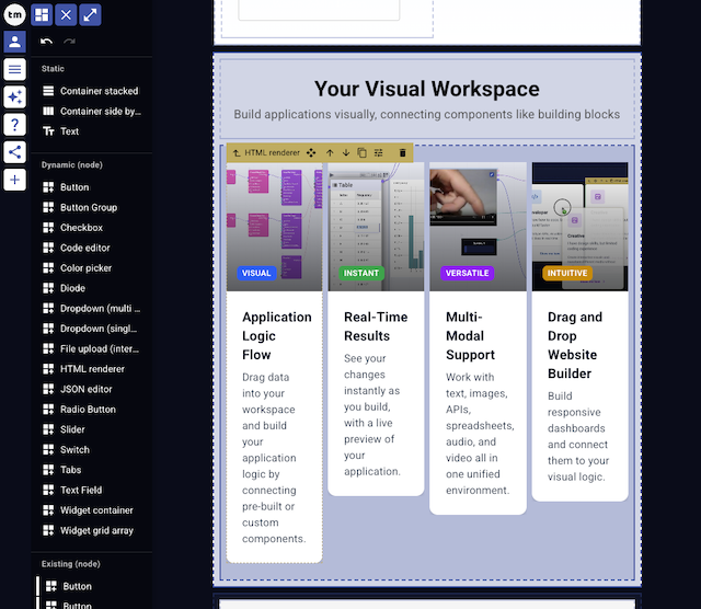
How to open
- Press
2to show/hide the user interface panel- Press
Eto enter/exit edit mode
- Press
- OR click the user interface icon in the top left corner
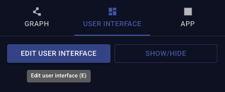
- Click the Edit user interface icon to enter/exit edit mode
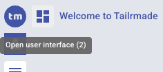 |  |
|---|---|
| Open/close the UI panel | Enter/exit edit mode (when panel is open) |
Add socket controls
The simplest way to add controls to your interface is to directly expose the sockets of nodes.
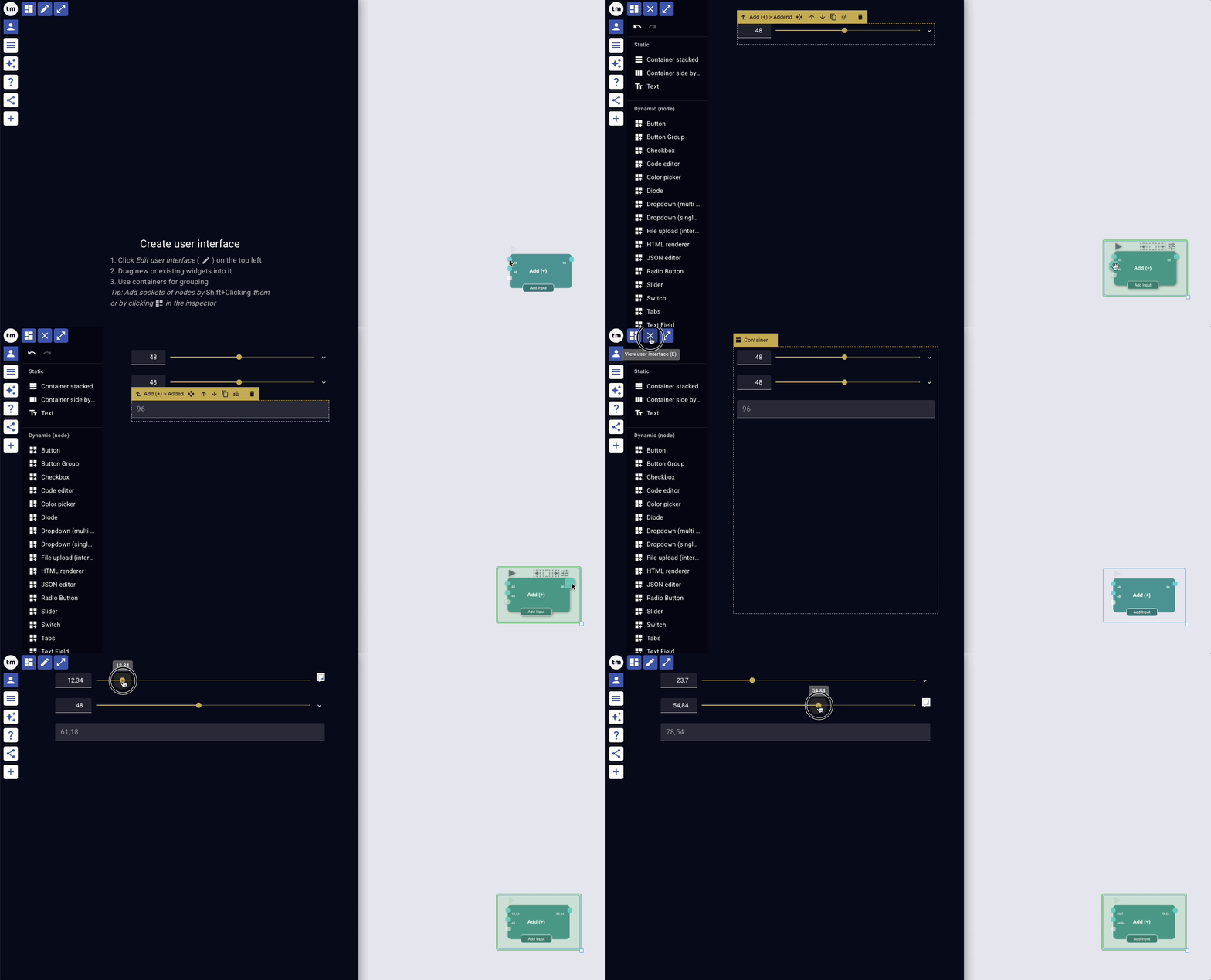
- Hold
Shiftand click on the socket - A widget for that socket is added to the interface
- the widget used depends on the socket type at the time of adding
This works for both input and output sockets.
OR
- Select the node
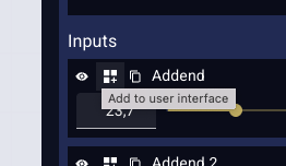
- Click the "Add to user interface" button in the inspector
Add widget node
All nodes with the Widget category can be added/exposed to the interface. Adding/Exposing creates a widget in the user interface which is linked to the node on the canvas. You can either
- add an existing node from the canvas
- OR add one directly in the editor
- which automatically creates a linked node on the canvas
Add widget from existing node
Use button on the node
- Hover over the node
- Click the "Add to user interface" button
- Click a 2nd time to confirm
- The editor is opened if not already and the widget is added
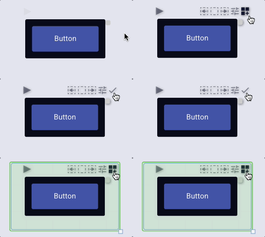
Use menu in the editor
- Open the user interface editor
- Go to the "Existing nodes" section on the left side menu
- this shows all widget nodes on the canvas
- hovering the list highlights the corresponding node on the canvas
- Click the one you want to add
- the widget is placed after the one selected
- if a container is selected, the widget is added inside the container
OR drag and drop it to the desired position
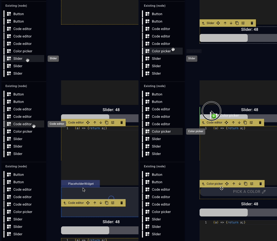
Add new widget/node
- Open the user interface editor
- Go to the "Dynamic (node)" section on the left side menu
- Click the one you want to add (the widget is placed after the one selected)
- OR drag and drop it to the desired position
- A corresponding/linked node is created on the canvas
Add layout nodes
To organize your interface you can use layout nodes. These nodes help structure and arrange your interface components. You can
- group widgets together
- toggle the visibility of groups
- manage their spacing and alignment
- add text labels and titles
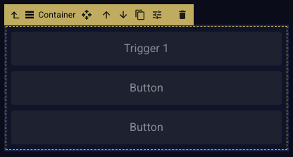
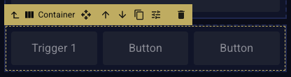
Use
- static widgets for fixed elements
- dynamic widgets if they should be controlled via the node graph
Add static layout widget
- Open the user interface editor
- Go to the "Static" section on the left side menu
- Click the one you want to add (the widget is placed after the one selected)
- OR drag and drop it to the desired position
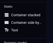
Add dynamic layout widget
Same as adding a widget node. Check "Search nodes" for available layout nodes.
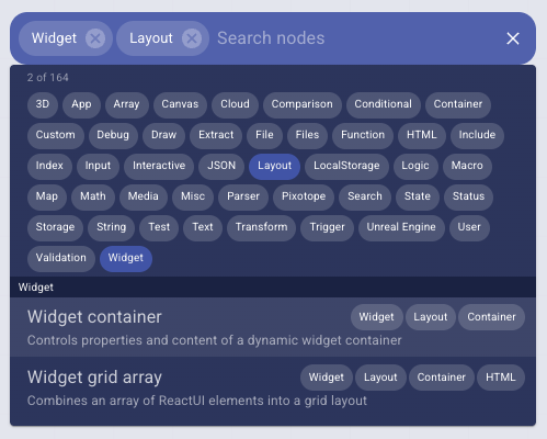
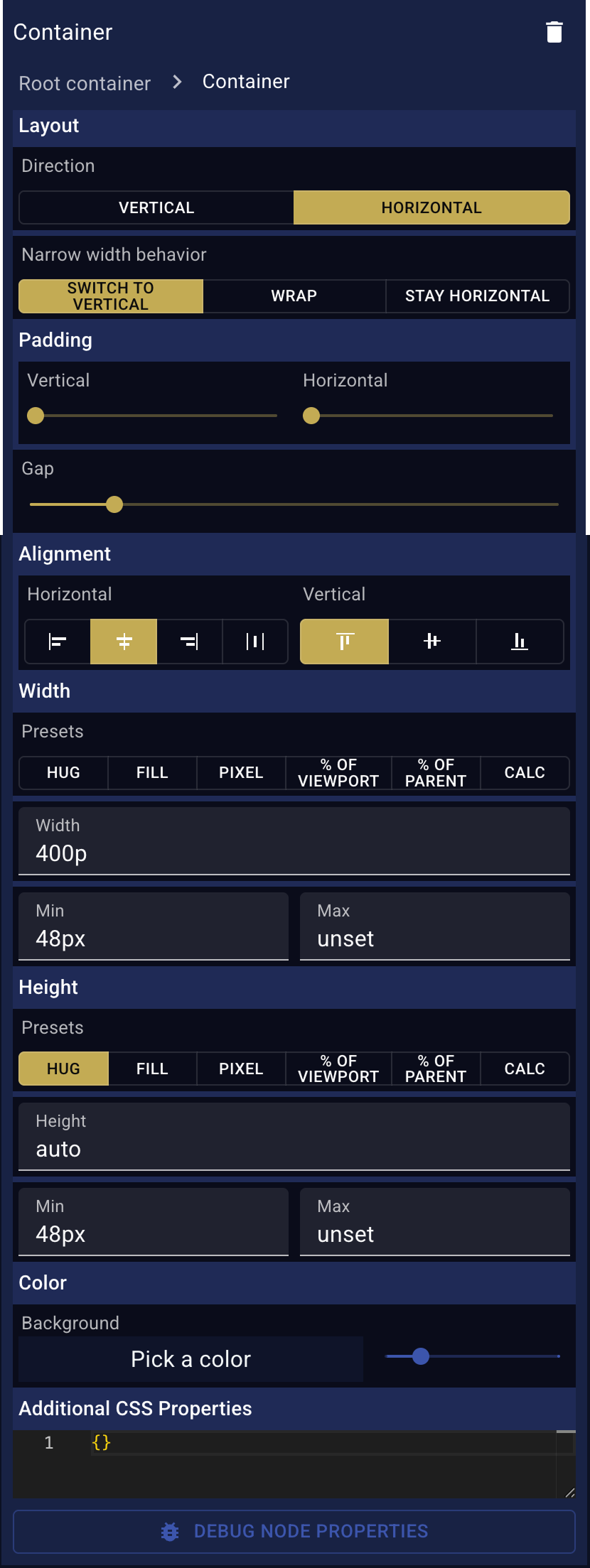
Edit widget properties
- Select the "User interface" tab in the inspector
- Select one of the widgets in the layer view or enter edit mode by pressing
Eor clicking the edit icon in the top left toolbar
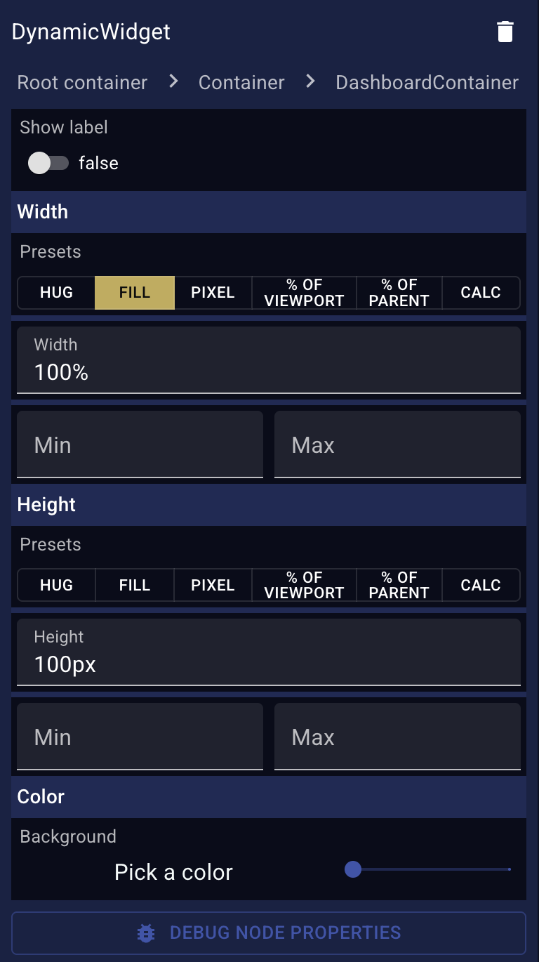
- Select the widget in the user interface
- Change the desired properties
| Dynamic widget properties (example) | Static widget properties (example) |
|---|---|
 |  |
Arrange widgets

Select a widget using the mouse
- Click on the widget
- Click on the "Select parent" icon in the widget header to select the parent container
Select a widget using the keyboard
- Press
Arrow upandArrow downkeys to cycle through widgets on the same level - Press
EnterandShift+Enterkeys to enter and exit containers (go one level down/up)
Move a widget
- Open the user interface editor
- Select the widget you want to move
- Click and drag the move icon in the widget headerand drop it to the desired position
- OR press
Alt+Arrow upandAlt+Arrow downbuttons to move it up/down
- OR press
Duplicate a widget
- Select the widget you want to duplicate
- Click the duplicate icon in the widget header
- A copy of the widget is created below the original one
Delete a widget
- Select the widget you want to delete
- Click the delete icon in the widget header
Control the visibility
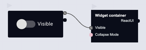
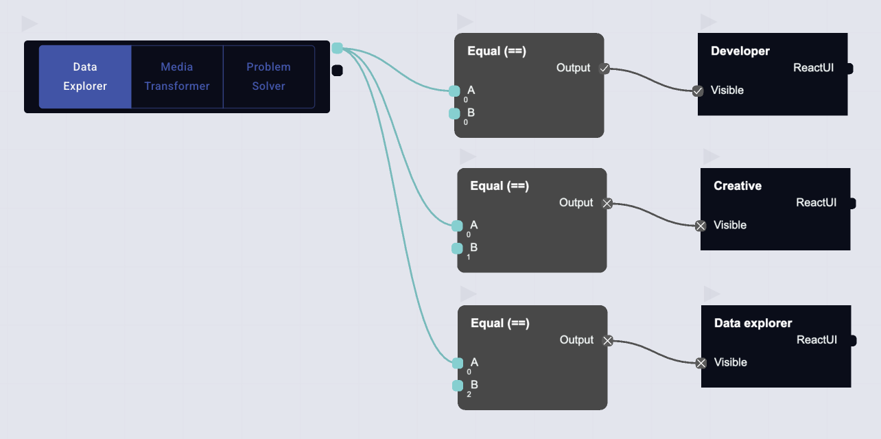
Show/hide elements based on state:
- Add a
Widget Containerto the user interface - Add/Move widgets inside the container
- On the canvas, connect a
Switchnode to the container'sVisibleinput- OR control its "Collapse Mode" input
- Optionally, add the
Switchwidget to the user interface for user control
Example controlling visibility via a "Button Group" (Tabs)
Create multi-page interfaces
Use the Widget Page node to build multi-page app flows within your user interface. Only one page is visible at a time within a page group, making it easy to create wizards, tabbed views, or multi-step forms.
How it works
Each Widget Page acts like a container — you place widgets inside it just like a regular container. Pages with the same Page Group are linked together: when one page becomes active, all other pages in that group automatically hide.
Add pages
- Open the user interface editor
- Search for Widget page in the node search or the "Dynamic (node)" section
- Add multiple page nodes and give each a unique Page Name (e.g. "Home", "Settings", "Profile")
- Place widgets inside each page
Page inputs
| Input | Description |
|---|---|
| Page Name | A unique name for the page (used to navigate to it) |
| Page Group | Groups pages together — only one page per group is visible at a time. Leave empty for the default group |
| Is Default Page | Mark one page per group as the default — it will activate automatically when the dashboard loads |
| Layout | Same layout options as a regular container (direction, padding, etc.) |
Page outputs
| Output | Description |
|---|---|
| Page Active | true when this page is currently visible |
| On Page Enter | Fires a trigger when this page becomes active — use it to run logic on page entry |
Navigate between pages
Use the Navigate to page node to switch pages. Connect it to a button or any trigger node.
- Add a Navigate to page node on the canvas
- Set the Page Name to the name of the target page
- Set the Page Group if targeting a specific group (leave empty for the default group)
- Connect a trigger (e.g. a Button node) to the Navigate input
Navigate to page inputs
| Input | Description |
|---|---|
| Page Name | The name of the page to navigate to (must match a Widget Page's Page Name) |
| Page Group | The group to navigate within (leave empty for the default group) |
| Navigate | Trigger input — set to true to perform the navigation |
Page groups
Page groups let you have independent sets of pages in the same interface. For example:
- A main navigation with pages "Home", "Settings", "Profile" (group: empty/default)
- A secondary tabbed section within one of those pages (group: "settings-tabs")
Navigating within one group does not affect pages in other groups.
Mark exactly one page per group as Is Default Page so users see content immediately when the dashboard loads.