Style your app
Your app's look is set in one place - the theme - and everything in the user interface reads from it. Widgets, containers and static text all follow the theme by default, so switching a preset or flipping to light mode restyles the whole app without touching a single widget.
You can still override any individual piece when you need to. This page covers the theme first, then the per-container escape hatches.
Open the theme settings
Press 5 (or click the App tab in the right drawer) and open the App
theme box.
The theme belongs to the app, not to a UI surface - it applies to every page of your interface.
The collapsed row summarises what is in force: the preset name, the mode, a
N changed chip if you have overridden anything, and swatches of the main
colors.
Presets
A preset is a complete look - colors for both light and dark, typography, geometry and control styles. Pick one as your starting point.
Switching preset is instant and non-destructive - your own app is the preview.
Switching a preset keeps any values you overrode by hand. That is deliberate, but it means a new preset can look wrong until you notice the overrides. The panel tells you: see Overrides.
Mode
Three choices: Light, Dark and System.
New apps are Dark. Every preset defines a complete set of colors for both modes, so switching can never leave you in a half-styled state.
System follows the viewer's operating-system preference.
Colors
Colors are authored as roles, not as a palette of arbitrary values. Each role has a job, and everything in the app that needs that job reads the role:
| Role | Used for |
|---|---|
primary | The main accent - buttons, active states |
secondary | The supporting accent |
background.default | The app's ground |
background.paper | Cards, widgets and panels sitting on the ground |
text.primary / text.secondary | Body text and its quieter companion |
divider | Rules and borders |
error / warning / info / success | Status colors |
You author only the base value of each role - hover states, active states and readable contrast text are derived from it.
If you set body text and background too close together, the panel shows a contrast warning with the measured ratio and the 4.5:1 that body text needs. It only warns - low contrast is allowed if you want it.
Typography, geometry and variants
- fontFamily / fontFamilyMono - the body and monospace families. Fonts load at runtime; fully offline viewers fall back to the stack's fallback family.
- fontSizeScalar - a multiplier on the whole type scale, not an absolute size. Only text scales; control heights and icons do not. It multiplies the fluid sizes below too, so the whole scale moves together.
- radius - corner rounding.
- density (controls) - the geometry of a control: height, inner padding,
icon size.
XSthroughXL. - spacingUnit (layout) - the geometry of layout: gaps, margins, surface padding. Independent of density on purpose - a compact form inside a generous card is a legitimate design.
- Default variants - the shape every button (
contained/outlined/text) and input (outlined/filled/standard) takes unless something overrides it.
Text that fits the screen it is on
Text widgets pick a variant rather than a pixel size, and the big ones are fluid: they shrink on a narrow app and grow on a wide one.
| Variant | Size |
|---|---|
display | 32px narrow → 48px wide |
stat | 28 → 40 |
h1 | 26 → 32 |
h2 | 20 → 24 |
h3, body, caption, label | one size, always |
The ends are reached at a 360px app and a 1024px app; in between the size moves smoothly, and outside it holds.
This measures the app's width, not the browser window - so the device preview shrinks headings exactly as a real phone would, and an embedded surface in a narrow column gets narrow-column headings even on a big screen.
Body, caption and label never move. Body text stays at 16px, which is the size below which iOS zooms in on a tapped field.
Do not reach for a smaller variant to make a heading fit a phone - that is what fluid sizing is for. Pick the variant that matches the heading's job.
Setting a font size by hand still wins over all of this.
Overrides and resetting
Changing any single value creates an override: your value wins over the preset's, and it survives a preset switch.
The panel makes this visible. When anything is overridden you get a notice listing every changed role, with:
- a ✕ on each chip to reset that one value back to the preset
- Reset all to drop every override at once
An overridden row is also marked individually, with its own reset button.
Change the theme while the app runs
Everything above is set once, in the App tab, and saved with the app. To let the app itself change its look - a preset switcher your viewers can use, a dark mode button, a brand color that comes from a database - add a Theme node.
The node has two dropdowns and one JSON socket:
- Preset - one of the presets, or Keep app setting to leave the saved preset alone
- Mode -
light,dark,system, or Keep app setting - Overrides - single values layered on top of the preset
Wire a dropdown widget into Preset and you have a working theme switcher.
The Theme node changes the theme for the current session only. It does not edit what is saved in the App tab, and a reload returns to the saved theme. That is deliberate: the app paints with its saved theme on the first frame, so nothing flashes unthemed while the graph is still starting up.
Overriding single values
The Overrides socket takes a JSON object whose keys are token names. There is no wrapper object - write the token directly:
{
  "primary": "#ff0055",
  "radius": 12,
  "density": "S",
  "byMode": {
    "dark": { "background.paper": "#121212" },
    "light": { "background.paper": "#ffffff" }
  }
}
Top-level keys apply in both modes. Colors under byMode apply in that
mode only - you can also write "light": { ... } / "dark": { ... } at the
top level, which means the same thing.
Use byMode for anything that should keep reacting to the light/dark toggle. A
color pinned at the top level is fixed in both modes, which makes the toggle a
no-op for that role.
The keys are the roles and values from the sections above:
| Group | Keys |
|---|---|
| Colors | primary, secondary, background.default, background.paper, text.primary, text.secondary, divider, error, warning, info, success |
| Typography | fontFamily, fontFamilyMono, fontSizeScalar |
| Geometry | radius, density (XS-XL), spacingUnit |
| Variants | buttonVariant (contained / outlined / text), inputVariant (outlined / filled / standard) |
Anything the node does not recognise - a misspelled key, a value of the wrong type - is not applied. The node turns yellow and says which key it dropped and what it expected, and the same list comes out of the node's Warnings output together with any contrast warnings. The Theme output carries the fully resolved theme, so you can feed the values that are actually in force into the rest of the graph.
Clearing the node's inputs again - both dropdowns back to Keep app setting and an empty JSON - hands the app back to its saved theme. So does deleting the node. With more than one Theme node in a graph, the last one to run wins.
How widgets pick up the theme
Most widgets expose a Color socket holding a palette role -
primary, secondary, success, error, info or warning - rather than a
literal color. The widget then renders in whatever that role currently resolves
to, so it follows the theme through every preset and both modes.
Color controls in the interface editor have a Theme checkbox. While it is ticked, that slot defers to the theme instead of naming a value:
- a text color defers by inheriting the surrounding text color
- a background defers by being fully transparent, so the themed surface behind it shows through
Untick it to pick a specific color, and tick it again to hand the slot back to the theme.
Customize container styling
Everything above is app-wide. Individual containers can go further.
In addition to Direction, Padding, Alignment, Width, Height, Background color, you can apply custom CSS styling to widget containers.
Emphasis
To make a container stand out - a group of related controls, a card for a result - set its Emphasis rather than a background color:
- None - the container paints nothing of its own
- Subtle - a faint tint of the theme's text color: slightly darker on a light app, slightly lighter on a dark one
- Strong - a card: the theme's paper color, a divider-colored border and a soft shadow
Once a container has an emphasis, its Tone picks the theme color it is drawn in: Neutral (the text and paper colors above), Primary or Secondary.
Both are built from the theme, so they keep working when the app switches between light and dark, or to another preset. A background color you pick yourself is only right in one mode. Corners follow the theme's radius.
A container that has its own background color keeps it. Emphasis then only adds the corners, and for Strong the border and shadow.
Custom CSS Properties
Add custom CSS properties as a JSON object to apply additional styles to a container:
Example:
{
  "border": "2px solid #3498db",
  "boxShadow": "0 4px 6px rgba(0,0,0,0.1)",
  "borderRadius": "8px",
  "fontFamily": "monospace"
}
These properties will be merged with the container's existing styles, allowing you to:
- Add borders and shadows
- Set custom fonts
- Apply transforms
- Add transitions and animations
- Override any CSS property
Custom CSS properties take precedence over the default container styles, allowing you to fine-tune the appearance of your UI.
A literal color here cannot follow the theme - it stays the same in light and dark and through every preset. Prefer the theme for color, and keep custom CSS for the things the theme does not cover.
Dynamic container styling
For dynamic layouts controlled by the node graph, use the Widget Container node's Layout socket:
- Add a
Widget Containernode to the canvas - Unhide the
Layoutinput socket - Construct the layout options using JSON nodes
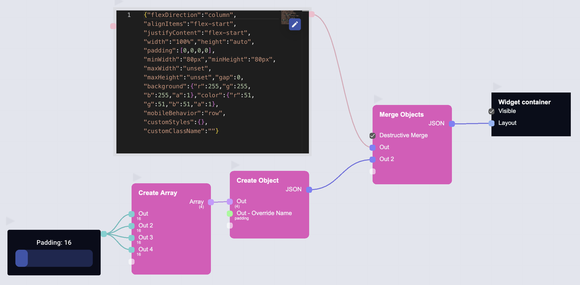
To see the base settings (JSON), drag a connection from the Layout socket, release the mouse and add a Code editor node
Which layer wins
From weakest to strongest:
- Preset - the look you started from
- Theme override - a role you changed by hand in the App theme box
- Theme node - what the running app pushed, for this session only
- Container / widget setting - a color or variant set on one element
- Custom CSS - the last word for that container
Anything left on Theme at step 4 falls through to the layers above it, which is what makes a preset switch reach the whole app.